The layout changes how customers use the page
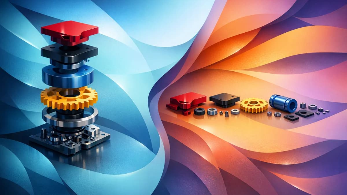
A parts diagram page has two main jobs.
It needs to show the customer where the part is, and it needs to show the product details clearly enough for them to buy.
The diagram does the first job. The parts list does the second. Your layout decides how those two pieces sit together.
Konfigr gives you two main layout options: stacked and side-by-side. Neither is always better. The right choice depends on the product, the diagram, the number of parts, and how your customers usually browse.
What stacked layout does
Stacked layout places the parts diagram and parts list one after the other.
This usually means the customer sees the diagram first, then scrolls down to the parts list. It is simple, familiar, and easy to follow.
Stacked layout works well when the diagram is not too large, the parts list is not too long, or the customer does not need to keep both views visible at the same time.
It can also suit pages where you want the product title, description, and diagram to feel like a single flow before the customer reaches the buying options.
When stacked is the better choice
Use stacked layout when the product is relatively simple.
If the diagram has a small number of markers, the customer can click a hotspot, scroll to the relevant part, and still understand what is happening. They are not trying to compare dozens of positions at once.
Stacked can also work well for mobile-first customers. Even though mobile stacks regardless of desktop settings, choosing stacked as the main layout can keep the desktop experience closer to the mobile one.
It is also a good choice when your diagram is wide and needs room across the page.
What side-by-side layout does
Side-by-side layout places the diagram and parts list next to each other on larger screens.
This is useful when customers need to move between the image and the list often. They can look at the diagram, click a marker, and see the related product without losing sight of the visual context.
For complex parts pages, that can make the experience feel much clearer.
A customer looking at a detailed machine, pump, or tool assembly may want to keep the diagram visible while they scan the matching parts.
When side-by-side is the better choice
Use side-by-side layout when the diagram is detailed or the parts list is long.
It is especially useful for desktop-heavy audiences, trade buyers, technical customers, and products where the diagram and list are used together.
If a customer is likely to click several markers, compare multiple parts, or add more than one item to cart, side-by-side can reduce friction.
The page feels less like reading from top to bottom and more like working with a visual catalogue.
Use the desktop column ratio properly
Side-by-side layout is not only about placing two columns next to each other.
The column ratio matters.
If the diagram is the main tool, give it more room. If the parts list contains detailed cards, images, stock status, and longer names, the list also needs enough width to breathe.
Konfigr includes desktop column ratio settings so you can choose a balanced layout or give the diagram more space.
Do not guess. Test both. A complex exploded view often benefits from a diagram-wider layout. A shorter, clearer diagram may work fine with equal columns.
Mobile always needs its own thinking
On mobile, the page stacks.
That is the right behaviour. A side-by-side layout does not make sense on a narrow phone screen. Customers need to see the diagram and parts list in a readable sequence.
This means your desktop layout choice should not ignore mobile. Test the page on a phone and check the actual order of content.
Make sure hotspots are easy to tap, the diagram is not too small, and the parts list cards are readable.
Product information position matters in stacked layout
When using stacked layout, think about where product information should sit.
Some stores want the product title and short description above the diagram. Others prefer the diagram to appear quickly, with supporting product information below.
Konfigr gives control over product info position when stacked. Use that setting to match the way customers use the page.
If the parent product description helps customers confirm the model, keep it visible before the diagram. If the customer already knows the model and just needs the part, keep the page tighter.
Part count is a useful guide
The more parts you show, the more valuable side-by-side layout becomes on desktop.
A Konfig with six parts can work beautifully stacked. A Konfig with forty parts may feel easier when the customer can keep the diagram beside the list.
There is no exact number where one layout becomes correct. But if customers need to scroll a lot while remembering where they were on the diagram, side-by-side is worth testing.
Let the product decide
Do not choose a layout because it looks modern. Choose the one that makes the page easier to use.
A small accessory kit may suit stacked. A detailed pump exploded view may suit side-by-side. A mobile-heavy retail audience may need simpler stacking. A trade audience ordering from desktop may prefer the diagram and list together.
Konfigr also supports per-Konfig overrides for selected settings, so one product can use a different layout where needed.
Use the global setting as your default. Override only when the product needs it.
The best layout is the one customers do not have to think about
A good layout feels obvious.
The customer sees the diagram, understands where to click, finds the matching part, and adds what they need.
If they keep losing their place, the layout is wrong. If the parts list feels cramped, adjust it. If the diagram is too small, give it more room. If the page feels too long, test side-by-side.
The layout is not decoration. It is part of the buying path.
Related Articles
Continue your learning with these related resources:
- Creating a Shopify Parts Diagram from Scratch (Comprehensive Guide)
- Handling Discontinued and Out-of-Stock Parts in Your Diagram
- Do You Need a Diagram? When a Parts List Alone Is Enough
- Importing Parts in Bulk with CSV
- Preparing Your Diagram Image: Photos, CAD Drawings, or Illustrations
- Using the Same Part Across Multiple Diagrams